Understanding Color Theory in Graphic Design
Color isn’t just a visual element; it’s a language that speaks directly to our emotions and perceptions. In graphic design, mastering color theory is essential for creating designs that resonate with audiences, convey the intended message, and evoke the right feelings. Let’s embark on a journey to understand how to use color effectively in your designs.
The Basics of Color Theory
Color theory is a framework used to understand how colors interact, combine, and influence perceptions. It provides guidelines for creating harmonious color combinations that are visually appealing.
The Color Wheel: Your Color Compass
Imagine the color wheel as your ultimate guide to color relationships. Developed by Sir Isaac Newton, the color wheel arranges colors in a circular pattern, helping designers select compatible color palettes. It’s divided into:
- Primary Colors: Red, blue, and yellow. These are the foundation of all other colors.
- Secondary Colors: Green, orange, and purple, created by mixing two primary colors.
- Tertiary Colors: Combinations of primary and secondary colors, like red-orange or blue-green.
Understanding this wheel is like learning the alphabet of color combinations.
Color Harmony: Crafting Visual Melody
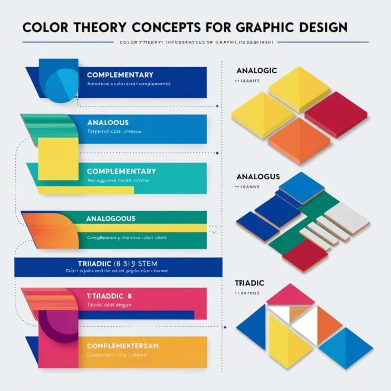
Color harmony refers to the arrangement of colors that are pleasing to the eye. It’s about creating a balance that feels right. Here are some classic schemes:
- Complementary: Colors opposite each other on the wheel, like red and green. They create high contrast and vibrant looks.
- Analogous: Colors next to each other, such as blue, blue-green, and green. They provide serene and comfortable designs.
- Monochromatic: Variations of one hue, incorporating different shades and tints. This scheme offers simplicity and elegance.
Each scheme sets a different mood and guides the viewer’s eye in unique ways.
The Psychology of Color: Speaking to the Soul
Colors do more than decorate; they communicate. Here’s a glimpse into what certain colors can convey:
- Red: Passion, urgency, excitement. Think of a sale sign screaming for attention.
- Blue: Trust, calm, professionalism. It’s the color of corporate logos and serene skies.
- Green: Growth, health, tranquility. Often associated with nature and wellness.
- Yellow: Optimism, energy, caution. It’s the color of sunshine and warning signs.
- Purple: Luxury, creativity, mystery. Think of royal robes and artistic endeavors.
Being mindful of these associations helps in crafting designs that resonate with your audience’s emotions.
Creating Visual Hierarchy with Color
Color isn’t just about aesthetics; it’s a tool for guiding the viewer’s attention. By strategically using color, you can:
- Highlight Key Elements: Use a bold color for call-to-action buttons to make them stand out.
- Group Related Items: Employ similar hues to show that certain elements are connected.
- Establish Flow: Utilize gradients or transitions to lead the viewer’s eye through the design.
This deliberate use of color ensures that your audience navigates your design as intended.
Cultural and Contextual Significance of Color
Colors carry different meanings across cultures and contexts. For instance, while white signifies purity in many Western cultures, it represents mourning in some Eastern societies. Being aware of these nuances ensures that your design is appropriate and resonates universally.
Practical Tips for Implementing Color Theory
- Start with a Neutral Base: Begin with neutral colors like white, black, or gray, and build your palette around them.
- Limit Your Palette: Too many colors can be overwhelming. Stick to a few that complement each other.
- Test Your Design: View your design in different lighting and on various devices to ensure color consistency.
- Stay Updated: Color trends evolve. Keep an eye on current design trends to ensure your work feels fresh.
Conclusion
Color theory is more than just a set of rules; it’s a toolkit for designers to create compelling, effective, and emotionally resonant designs. By understanding the relationships between colors, their psychological impacts, and cultural significances, you can craft designs that not only look good but also communicate effectively with your audience.
Note: For more insights into design elements and color usage, you might find this article helpful: Design Elements.