Typography in Web Design: Choosing the Right Fonts
Typography is one of the most important elements in web design. It plays a crucial role in determining how your content is perceived, how easily it can be read, and how it influences the overall aesthetics of your website. Choosing the right fonts can significantly enhance both the usability and the visual appeal of your site. In this article, we will guide you through the process of selecting and implementing fonts that not only improve readability but also align with your website’s design goals.
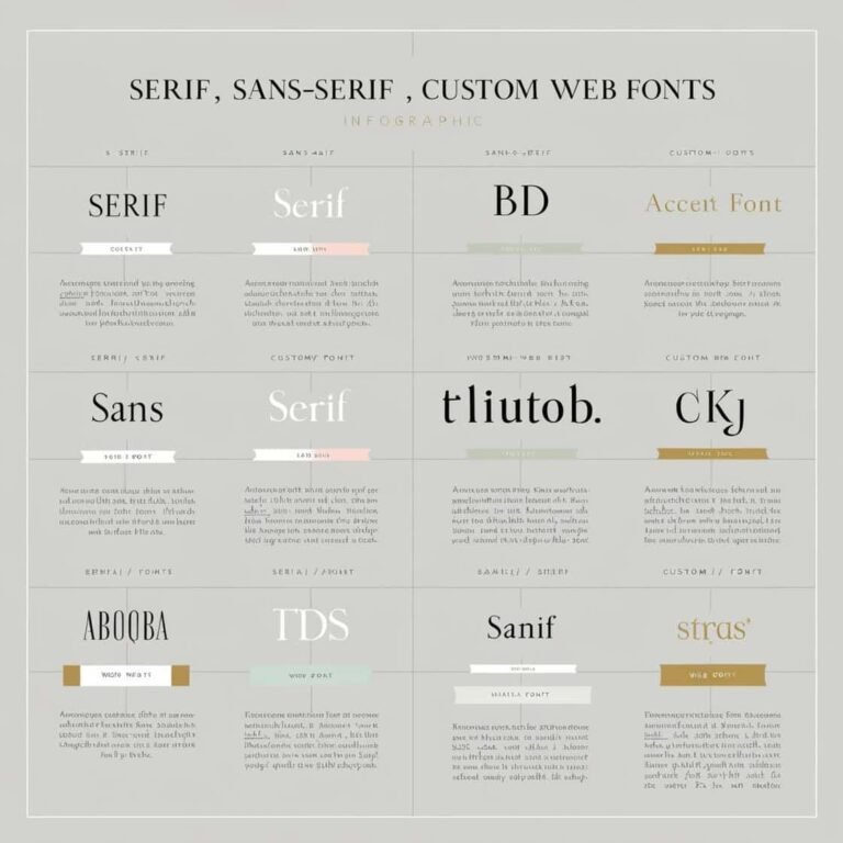
Why Typography Matters in Web Design
Good typography isn’t just about making text look pretty. It impacts user experience, accessibility, and even the credibility of your website. When done correctly, typography can:
- Enhance Readability: Clear, well-spaced fonts make content easier to read, which encourages users to stay longer on your site.
- Establish a Visual Hierarchy: Proper use of fonts can help users easily navigate your content by guiding them through different levels of information.
- Set the Tone: Fonts can convey the personality of your brand. Whether you’re aiming for a formal, playful, or modern vibe, the right font choices will communicate that to your audience.
- Boost Aesthetics: Fonts are key to a harmonious and attractive design, contributing to the overall user experience.
Let’s explore the best practices for choosing and implementing fonts that achieve all these goals.
1. Understand Your Website’s Purpose and Audience
Before diving into specific fonts, it’s crucial to consider the purpose of your website and who your audience is. Different fonts can evoke different emotions, and selecting one that matches your website’s tone is essential.
- Business/Corporate Websites: If your website is professional or corporate, you’ll want to choose fonts that are clean, modern, and easy to read. Serif fonts like Times New Roman or Georgia can lend a sense of tradition, while sans-serif fonts like Helvetica or Roboto offer a more contemporary, clean look.
- Creative/Portfolio Websites: For artists, designers, or photographers, a more experimental or artistic font may work better. Fonts like Playfair Display or Lobster can reflect creativity and uniqueness.
- E-commerce Websites: When designing for e-commerce, readability is key. Focus on fonts like Open Sans or Arial, which are legible at various sizes and on multiple devices.
Tip: Consider your audience’s age, location, and preferences when making font choices. If your target audience is older, you may want to choose larger, more readable fonts.
2. Choose Fonts That Enhance Readability
Readability is the cornerstone of good web typography. If your fonts are difficult to read, visitors may leave your site quickly. Here are a few tips to improve readability:
Font Size
Make sure the font size is large enough for comfortable reading. For body text, a size of 16px is often ideal. Larger text may be needed for headings and smaller text for fine print, like copyright notices or footnotes.
Line Height and Letter Spacing
Proper line height (leading) is essential to make the text easy to read. A line height of 1.5 to 1.8 times the font size is recommended. For example, if your body text is 16px, a line height of 24px-28px will enhance readability.
Letter spacing (tracking) also affects legibility. Avoid tight letter spacing, which can make text hard to read, especially in body copy.
Contrast
Ensure sufficient contrast between text and background colors. Light text on dark backgrounds or dark text on light backgrounds generally works best. High contrast helps readability for users with visual impairments.
Web Safe Fonts
Web-safe fonts are those that are widely supported across different devices and browsers. These fonts include Arial, Georgia, Times New Roman, and Verdana. While they may not be the most unique, they are reliable and highly readable.
3. Limit the Number of Fonts
Using too many fonts on a single webpage can make it look chaotic and unprofessional. A good rule of thumb is to stick to two to three fonts at most. One font should be used for headings, and another for body text. You can add a third font for accentuating elements like quotes or call-to-action buttons.
Font Pairing Tips
When pairing fonts, aim for contrast and harmony. Choose fonts that complement each other. For example, a serif font for headings and a sans-serif font for body text often works well. Here are a few popular pairings:
- Montserrat (headings) + Open Sans (body)
- Merriweather (headings) + Roboto (body)
- Playfair Display (headings) + Source Sans Pro (body)
Avoid pairing fonts that are too similar in style or too different in size or weight, as this can create visual tension.
4. Use Web Fonts and Google Fonts
Web fonts allow you to use custom fonts on your website without worrying about font availability on different devices. Google Fonts is a popular, free service that provides a vast selection of web-friendly fonts.
Using Google Fonts, you can easily add custom fonts to your site. Here’s how to implement a Google Font:
- Visit Google Fonts and select the font you want.
- Copy the link provided under the “Embed” tab and paste it inside the
<head>tag of your HTML.
Example:
<link href="https://fonts.googleapis.com/css2?family=Roboto:wght@400;700&display=swap" rel="stylesheet">- Add the font family to your CSS.
body {
  font-family: 'Roboto', sans-serif;
}
By using web fonts, you can ensure that the fonts you select are consistently displayed across all devices.
5. Consider Mobile Responsiveness
With more people browsing the web on mobile devices, it’s essential to ensure that your font choices work well on small screens. Mobile users may struggle to read small text, so consider adjusting font sizes for mobile devices.
Responsive Typography
Use media queries to adjust font sizes depending on the viewport size. For example:
body {
  font-size: 16px;
}

@media (max-width: 768px) {
  body {
    font-size: 14px;
  }
}
This ensures that your text remains readable across various devices.
6. Test Your Fonts Across Devices
Before finalizing your typography choices, test your fonts across different devices and browsers to ensure they look as intended. Some fonts may render differently on various devices, so it’s important to verify the appearance on desktop, tablet, and mobile platforms.
7. Accessibility Considerations
When selecting fonts, keep accessibility in mind. Certain font choices can make it difficult for users with visual impairments to read your content. Here are a few accessibility tips:
- Avoid overly decorative fonts: These can be hard to read, especially for users with dyslexia or other cognitive impairments.
- Use adequate contrast: Ensure that there is enough contrast between the text and background colors.
- Provide an option to increase font size: Consider adding a feature that allows users to adjust the text size on your website.
Conclusion
Typography in web design is about more than just choosing a font that looks nice—it’s about creating a pleasant reading experience that supports your website’s goals. By considering readability, the overall aesthetic, the website’s purpose, and accessibility, you can choose the perfect fonts for your project.
When you combine the right fonts with thoughtful implementation, your website’s content will not only look professional but also be easier to read, ensuring a better experience for all visitors. Happy designing!
For more tips and best practices on web design, be sure to check out related articles on DNN Engineer.
