Introduction to Graphic Design Principles for Websites: A Beginner’s Guide
Graphic design plays a crucial role in creating visually appealing, user-friendly websites. Whether you’re designing a personal blog or a corporate website, understanding the principles of graphic design is essential. In this tutorial, we’ll walk you through key graphic design principles that are used to create beautiful, functional websites. We’ll cover the basics of design, step-by-step instructions, and best practices, with examples and code snippets to help you get started.
1. What is Graphic Design for Websites?
Graphic design for websites involves the art and practice of planning and projecting visual elements on the web. It’s about combining elements like text, images, colors, and layout in a way that enhances the user experience while maintaining a visually pleasing aesthetic.
Key goals of website graphic design:
- Usability: Ensuring users can easily navigate and interact with the site.
- Aesthetics: Creating a visually appealing site that aligns with the brand or message.
- Functionality: Design should facilitate the content and goals of the site, such as clear calls to action and a smooth user experience.
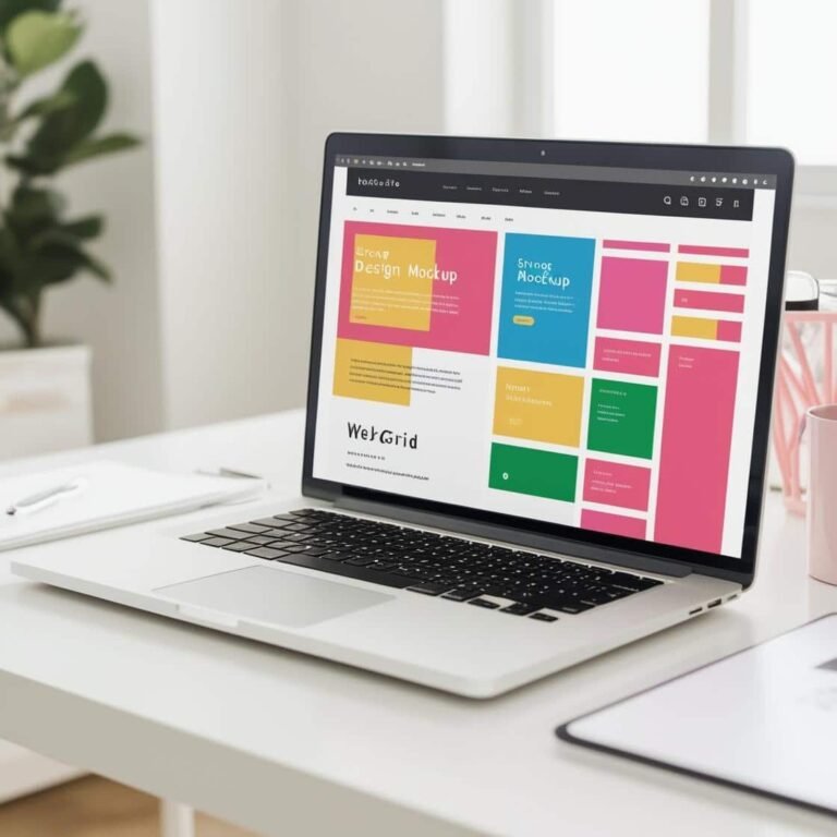
2. Key Graphic Design Principles for Websites
Contrast
What is contrast?
Contrast refers to the difference between elements, like light vs. dark colors or large vs. small text, to make key areas stand out. High contrast helps guide the user’s attention to important content.
How to use contrast:
- Use contrasting colors for text and background to ensure readability.
- Make headings larger or in bold fonts to contrast with body text.
Example:
<h1 style="color: #333333;">This is a Heading</h1>
<p style="color: #FFFFFF; background-color: #333333;">This paragraph has high contrast to make it readable.</p>
Alignment
What is alignment?
Alignment is about ensuring that the elements on your page are visually connected. Everything should be lined up either to the left, center, or right to create a balanced and orderly layout.
How to use alignment:
- Text should generally be left-aligned for easy reading.
- Centering can be used for headers or important messages to grab attention.
Example:
<h1 style="text-align: center;">Welcome to Our Website</h1>
<p style="text-align: left;">This text is aligned to the left for better readability.</p>
Repetition
What is repetition?
Repetition refers to using consistent elements throughout your design, such as fonts, colors, or patterns. Repeating elements helps create unity and cohesion within the website.
How to use repetition:
- Use the same font family throughout your site.
- Reuse colors for buttons, links, and headings to create a cohesive feel.
Example:
<button style="background-color: #007bff; color: white; padding: 10px 20px;">Click Me</button>
<a href="#" style="color: #007bff;">Learn More</a>
Proximity
What is proximity?
Proximity involves grouping related elements together. When elements are close to one another, they’re perceived as being related, making it easier for users to find and understand information.
How to use proximity:
- Group related information, such as contact details or navigation links, to create logical sections on the page.
Example:
<div style="margin-bottom: 20px;">
  <h2>Contact Us</h2>
  <p>Phone: 123-456-7890</p>
  <p>Email: example@example.com</p>
</div>
White Space (Negative Space)
What is white space?
White space, or negative space, refers to the empty areas between elements. It’s essential for making designs look less cluttered and more balanced. White space can help emphasize key content and improve readability.
How to use white space:
- Avoid overcrowding text or images; allow sufficient breathing room between elements.
Example:
<div style="padding: 20px;">
  <h2>Our Services</h2>
  <p style="margin-top: 10px;">We offer a variety of services to help your business succeed.</p>
</div>
Hierarchy
What is hierarchy?
Hierarchy is the arrangement of elements in a way that signals their importance. The most important elements (like headings) should stand out the most, and the least important elements (like disclaimers) should be less prominent.
How to use hierarchy:
- Use large, bold fonts for headings and subheadings.
- Use smaller, regular fonts for body text.
Example:
<h1 style="font-size: 36px;">Main Title</h1>
<h2 style="font-size: 24px;">Subtitle</h2>
<p style="font-size: 16px;">This is body text.</p>
Consistency
What is consistency?
Consistency in design means keeping similar elements throughout the site. This includes maintaining consistent colors, fonts, and layouts across pages, which helps users feel comfortable and familiar with the site.
How to use consistency:
- Use the same color palette and font style across all pages.
- Ensure buttons and links look and behave the same throughout the website.
3. Step-by-Step Instructions for Designing a Website
Choosing a Color Scheme
Start by selecting a color scheme that aligns with your brand or website theme. A good color scheme should consist of:
- Primary colors (main color of your website).
- Secondary colors (complementary or accent colors).
- Neutral colors (for background and text, like white, gray, black).
Example:
<style>
  body {
    background-color: #f4f4f4;
    color: #333333;
  }

  h1 {
    color: #0056b3;
  }

  p {
    color: #666666;
  }
</style>
Selecting Fonts
Choose web-safe fonts that are easy to read on screens. Google Fonts is a great resource for free, high-quality fonts. Ensure that the fonts are consistent across headings and body text.
Example:
<link href="https://fonts.googleapis.com/css2?family=Roboto:wght@400;700&display=swap" rel="stylesheet">
<style>
  body {
    font-family: 'Roboto', sans-serif;
  }
</style>
Creating Layouts
Layouts determine the structure of your website. A simple, effective layout could include a header, main content section, and footer. Use a grid system (like CSS Grid or Flexbox) to align elements.
Example (Flexbox Layout):
<style>
  .container {
    display: flex;
    justify-content: space-between;
    margin: 20px;
  }

  .item {
    width: 30%;
    padding: 10px;
    background-color: #f9f9f9;
  }
</style>

<div class="container">
  <div class="item">Item 1</div>
  <div class="item">Item 2</div>
  <div class="item">Item 3</div>
</div>
4. Best Practices for Website Design
Responsive Design
Ensure your website looks good on all devices (phones, tablets, desktops). Use media queries in CSS to adjust layouts for different screen sizes.
Example:
  @media (max-width: 768px) {
    .container {
      flex-direction: column;
    }
  }
Mobile-First Approach
Design your website for mobile devices first, then scale up to larger screens. This approach ensures your website performs well on all devices.
Optimizing for Speed
Use compressed images, minimalistic designs, and efficient code to make sure your site loads quickly.
5. Code Snippets & Examples
Here’s a simple HTML and CSS example that uses many of the principles we’ve discussed:
<!DOCTYPE html>
<html lang="en">
<head>
  <meta charset="UTF-8">
  <meta name="viewport" content="width=device-width, initial-scale=1.0">
  <title>My Website</title>
  <link href="https://fonts.googleapis.com/css2?family=Roboto:wght@400;700&display=swap" rel="stylesheet">
  <style>
    body {
      font-family: 'Roboto', sans-serif;
      background-color: #f4f4f4;
      color: #333333;
      margin: 0;
      padding: 0;
    }
    header {
      background-color: #0056b3;
      color: white;
      padding: 20px;
      text-align: center;
    }
    .container {
      display: flex;
      justify-content: space-between;
      padding: 20px;
    }
    .item {
      width: 30%;
      padding: 20px;
      background-color: #ffffff;
      box-shadow: 0 2px 4px rgba(0, 0, 0, 0.1);
    }
    footer {
      background-color: #333333;
      color: white;
      text-align: center;
      padding: 10px;
    }
  </style>
</head>
<body>
  <header>
    <h1>Welcome to My Website</h1>
  </header>
  <div class="container">
    <div class="item">Content 1</div>
    <div class="item">Content 2</div>
    <div class="item">Content 3</div>
  </div>
  <footer>
    <p>© 2025 My Website</p>
  </footer>
</body>
</html>
6. HTML and CSS for Layout
In this section, you would focus on using HTML and CSS to create layouts. Learn how to use CSS Grid or Flexbox to create responsive layouts that adjust for different screen sizes. CSS Flexbox is especially useful for one-dimensional layouts, while CSS Grid is ideal for two-dimensional grids.
7. Adding Colors and Fonts
Use CSS to apply colors and fonts across your website. Choose a color palette that complements your brand and ensures readability. Also, select fonts that are easy to read, particularly for body text, and use font sizes and weights strategically to establish hierarchy.
Tip:
- Use
font-familyin CSS to apply fonts from Google Fonts, andbackground-colorto apply colors to various elements.
6. Conclusion & Tips
Graphic design for websites is about creating a visual structure that is aesthetically pleasing and functional. By following the principles of contrast, alignment, repetition, proximity, white space, hierarchy, and consistency, you can create designs that guide users smoothly through your website.
Tips for beginners:
- Start simple. Focus on the basics before trying complex designs.
- Use design tools like Adobe XD, Figma, or Sketch to experiment with layouts.
- Learn from other websites: Study successful websites and see how they apply design principles.
With practice, you’ll improve your skills and create websites that not only look great but also provide a better user experience. Happy designing!