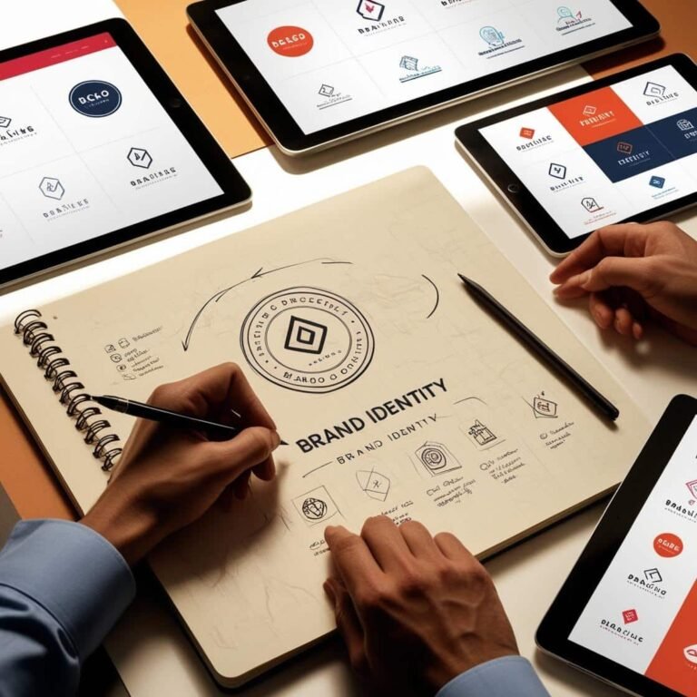
Designing Logos: Tips for Creating Memorable Brand Identity
A logo is often the first thing people notice about a brand, and it plays a pivotal role in how customers perceive a company. A well-designed logo is not just a piece of art; it’s the foundation of your brand’s identity. It conveys the essence of your company, creating a visual representation of your values, mission, and vision. In this article, we’ll explore key principles for designing logos that are both memorable and reflective of your brand’s identity, while standing out in today’s competitive market.
What Makes a Logo Effective?
Before diving into the tips, it’s important to understand what makes a logo effective. A great logo is simple, scalable, timeless, relevant, and memorable. It should evoke the right emotions and align with your brand’s message, leaving a lasting impression on your audience. Think about logos like Nike’s swoosh or McDonald’s golden arches—these are not just symbols, they are cultural icons.
1. Keep It Simple
Simplicity is key in logo design. A logo should be easy to recognize and recall. Overcomplicating it with intricate details or excessive colors can make it harder for customers to identify and remember. Some of the most iconic logos in history are simple yet powerful.
Take Apple’s logo, for example. It’s just an apple with a bite taken out, but it perfectly conveys the brand’s simplicity, innovation, and elegance. A clean design is also versatile and works well across different media, from business cards to billboards.
Example:
Consider the FedEx logo, which uses a hidden arrow in the negative space between the “E” and “X.” This simple design adds depth and creativity without overloading the viewer.
2. Make It Relevant to Your Brand
A logo should tell a story about your business. Whether it’s the colors, shapes, or imagery, every element of the logo should reflect your brand’s personality and values.
If you’re a tech company, you might opt for clean, modern lines to convey innovation. If your brand focuses on natural products, earthy tones and organic shapes may work better.
Example:
The green color and leaf in the Whole Foods Market logo symbolize health and sustainability, aligning perfectly with their brand ethos of organic and eco-friendly products.
3. Be Unique and Memorable
In a crowded market, it’s important that your logo stands out. A unique logo captures attention and makes a strong impression, ensuring that your brand stays top-of-mind. Avoid using generic icons or trends that might fade over time.
Think about how the Pepsi logo has evolved over the years but always maintained its core shape and color scheme, keeping it instantly recognizable. A logo that’s different from others in your industry will help set your brand apart and make it memorable to consumers.
Tip:
Do a competitive analysis before designing your logo. Look at logos of your competitors to ensure you’re creating something distinctive. You want your logo to stand out in a crowd, not blend in.
4. Choose the Right Colors
Color plays an important role in how a logo is perceived. Different colors evoke different emotions and can influence consumer behavior. For example, blue is often associated with trust and professionalism, while red can evoke excitement or passion.
It’s important to choose colors that align with the message and emotions you want to convey. For instance, a luxury brand might use black or gold for sophistication, while a children’s brand might opt for brighter, more playful colors.
Example:
Coca-Cola’s use of red is a classic example. The color conveys energy, passion, and excitement, which resonates with the vibrant and lively nature of their brand.
5. Ensure Scalability and Versatility
Your logo will appear in many different sizes and contexts, so it must be scalable and versatile. It should look just as good on a business card as it does on a billboard or a website. The design should maintain its integrity when resized and should still be legible in black and white, in addition to color.
Tip:
Test your logo at different sizes. Does it remain clear when scaled down to a small size, like on a social media profile picture? If not, simplify it.
6. Avoid Following Trends
While it’s tempting to create a trendy logo, trends can quickly become outdated. A logo that’s designed based on a current trend may look fresh today but can feel stale in a few years. A timeless logo, on the other hand, will remain relevant and impactful for the long haul.
Example:
Think about the classic Nike swoosh—it’s simple, clean, and hasn’t changed much over the years. Its timelessness is a major part of its success.
7. Test and Get Feedback
Designing a logo is a process, and it’s important to test your design before finalizing it. Share it with a small group of people who fit your target audience to get feedback. Ask them what emotions or messages the logo conveys to them.
It’s also a good idea to work with a professional designer who can provide expertise and insights that you might miss as a business owner. Sometimes, getting an outsider’s perspective can lead to improvements you hadn’t considered.
Conclusion
Designing a logo is a crucial step in building a brand identity that resonates with your audience. By following these tips—keeping your logo simple, relevant, unique, and timeless—you can create a memorable visual identity that stands the test of time. A great logo not only reflects who you are as a brand but also helps you build trust, recognition, and loyalty with your customers. So, whether you’re starting a new venture or rebranding an existing company, investing time and effort into your logo design will pay off in the long run.

