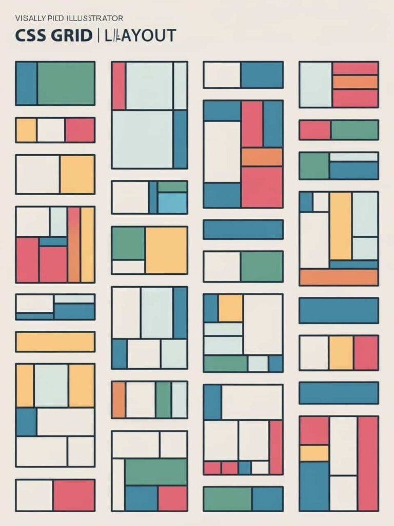
CSS Grid: Building Layouts for Modern Web Design
In the ever-evolving world of web design, creating flexible and responsive layouts is essential. Enter CSS Grid, a powerful tool that revolutionizes how we structure web pages. Let’s dive into understanding CSS Grid and how it can elevate your web design projects.
What is CSS Grid?
CSS Grid Layout, commonly known as CSS Grid, is a two-dimensional layout system for the web. It allows designers and developers to create complex layouts with ease, controlling both rows and columns simultaneously. Unlike previous methods like floats or tables, CSS Grid offers a more efficient and predictable approach to web layout design.
Why Choose CSS Grid?
You might wonder, “Why should I switch to CSS Grid when there are other layout systems?” Here are some compelling reasons:
- Two-Dimensional Layouts: CSS Grid enables precise control over both horizontal and vertical layouts, making it ideal for complex designs.
- Responsiveness: With CSS Grid, creating responsive designs that adapt seamlessly to various screen sizes becomes straightforward.
- Simplified Code: It reduces the need for numerous CSS classes and complex calculations, leading to cleaner and more maintainable code.
Getting Started with CSS Grid
To harness the power of CSS Grid, you’ll need to define a grid container and its items. Here’s a step-by-step guide:
- Define the Grid Container: Set the
displayproperty of your container togrid:.container { display: grid; } - Create Grid Columns and Rows: Use
grid-template-columnsandgrid-template-rowsto define the number and size of columns and rows:.container { display: grid; grid-template-columns: 1fr 2fr; /* Two columns with a 1:2 ratio */ grid-template-rows: auto; /* Rows adjust based on content */ } - Place Grid Items: Grid items are automatically placed into the grid. You can control their position using properties like
grid-columnandgrid-row:.item { grid-column: 1 / 2; /* Span from column line 1 to 2 */ grid-row: 1; /* Place in the first row */ }
Building a Responsive Layout with CSS Grid
One of the standout features of CSS Grid is its responsiveness. Let’s create a simple, responsive layout:
.container {
  display: grid;
  grid-template-columns: repeat(auto-fill, minmax(200px, 1fr));
  gap: 16px;
}

.item {
  background-color: #f0f0f0;
  padding: 20px;
  border: 1px solid #ccc;
}
In this example:
grid-template-columns: repeat(auto-fill, minmax(200px, 1fr));creates as many columns as can fit, each with a minimum width of 200px and a maximum of 1 fraction of the available space.gap: 16px;adds space between grid items.
This setup ensures that the layout adjusts gracefully across different screen sizes, providing an optimal viewing experience.
Advanced Features of CSS Grid
CSS Grid offers several advanced features to enhance your layouts:
- Grid Areas: Define sections of your layout for more intuitive placement.
.container { display: grid; grid-template-areas: "header header header" "sidebar main main" "footer footer footer"; } .header { grid-area: header; } .sidebar { grid-area: sidebar; } .main { grid-area: main; } .footer { grid-area: footer; } - Implicit Grids: Automatically create rows or columns when grid items are placed outside the defined grid.
- Alignment and Justification: Control the alignment of grid items both horizontally and vertically using properties like
align-items,justify-items,align-self, andjustify-self.
Browser Support and Compatibility
As of March 2025, CSS Grid is supported by all major browsers, including Chrome, Firefox, Safari, and Edge. However, it’s always a good practice to check for compatibility, especially when working on projects that need to support older browsers.
Conclusion
CSS Grid is a game-changer in web design, offering unparalleled control and flexibility for creating responsive and complex layouts. By incorporating CSS Grid into your workflow, you can streamline your design process and deliver modern, user-friendly web pages.
Note: For more in-depth tutorials and examples on CSS Grid, consider exploring resources available on DNN Engineer and Online Dealings.
