Mastering Flexbox for Responsive Layouts: A Deep Dive into Using Flexbox for Modern Web Design
When it comes to creating responsive, modern web layouts, Flexbox has become an essential tool for web designers and developers. It offers a simple yet powerful approach to building flexible and dynamic layouts without the need for complex CSS grid systems or floating elements. Whether you’re just starting with CSS or looking to refine your layout skills, mastering Flexbox is an invaluable step toward designing efficient, responsive websites.
In this guide, we will take a deep dive into the principles of Flexbox, explore its key features, and provide practical examples to help you get the most out of this layout model. By the end of this article, you’ll have a solid understanding of how to leverage Flexbox to create beautiful, flexible, and responsive web layouts.
What is Flexbox?
Flexbox (short for “Flexible Box”) is a layout module in CSS designed to provide an easier way to distribute space and align items in a container, even when the container’s size is unknown or dynamic. Unlike traditional layout techniques that rely on floats or positioning, Flexbox offers a more efficient way to design layouts that adapt to different screen sizes.
Flexbox works by applying a container property (display: flex) to an element, which then transforms its child elements into flex items. These flex items can be aligned, spaced, and distributed in various ways using simple properties.
Core Concepts of Flexbox
Before diving into practical examples, it’s important to understand the core concepts and properties of Flexbox.
1. Flex Container and Flex Items
To start using Flexbox, you need a container element (the “flex container”) that holds the items (the “flex items”). By applying display: flex or display: inline-flex to the container, you automatically enable Flexbox for all its children.
.container {
  display: flex;
}
In this example, .container is now a flex container, and all the direct child elements inside it become flex items.
2. Main Axis and Cross Axis
Flexbox operates on two axes: the main axis and the cross axis.
- The main axis is the primary axis along which the flex items are laid out. By default, this is horizontal (left to right), but you can change it to vertical using the
flex-directionproperty. - The cross axis is perpendicular to the main axis. If the main axis is horizontal, the cross axis is vertical, and vice versa.
3. Flex Direction
The flex-direction property defines the direction of the main axis and determines how the flex items are positioned inside the container.
row(default): Items are placed in a row, from left to right.row-reverse: Items are placed in a row, but in reverse order (from right to left).column: Items are placed in a column, from top to bottom.column-reverse: Items are placed in a column, but in reverse order (from bottom to top).
.container {
  display: flex;
  flex-direction: row;
}
4. Justify Content
The justify-content property controls the alignment of flex items along the main axis. It helps distribute space between items and aligns them as needed.
flex-start: Aligns items at the start of the container.flex-end: Aligns items at the end of the container.center: Aligns items in the center of the container.space-between: Distributes items with equal space between them.space-around: Distributes items with equal space around them.
.container {
  display: flex;
  justify-content: space-between;
}
5. Align Items
The align-items property aligns flex items along the cross axis. This is useful for vertically centering items in a container or distributing them evenly across the cross axis.
flex-start: Aligns items at the start of the cross axis.flex-end: Aligns items at the end of the cross axis.center: Centers items along the cross axis.stretch(default): Stretches items to fill the container along the cross axis.baseline: Aligns items along their baseline.
.container {
  display: flex;
  align-items: center;
}
6. Align Self
The align-self property allows you to override the align-items value for individual flex items. This is useful if you want to align a specific item differently from the others.
.item {
  align-self: flex-start;
}
7. Flex Wrap
By default, Flexbox places all items in a single line, which may not work well if you have a large number of items. The flex-wrap property allows items to wrap onto multiple lines if necessary.
nowrap(default): Prevents wrapping.wrap: Allows items to wrap onto multiple lines.wrap-reverse: Wraps items in reverse order.
.container {
  display: flex;
  flex-wrap: wrap;
}
8. Flex Grow, Flex Shrink, and Flex Basis
These properties control how flex items grow, shrink, and define their initial size within the container.
flex-grow: Specifies how much a flex item should grow relative to the other items.flex-shrink: Specifies how much a flex item should shrink relative to the other items when there is not enough space.flex-basis: Defines the initial size of a flex item before any space distribution occurs.
You can also use the shorthand flex to combine all three properties.
.item {
  flex: 1 1 200px; /* flex-grow | flex-shrink | flex-basis */
}
Building Responsive Layouts with Flexbox
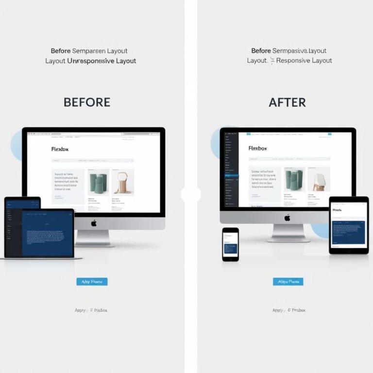
One of the most powerful features of Flexbox is its ability to create responsive layouts without the need for media queries or complex grid systems. By combining the properties discussed above, you can easily adjust the layout of your page based on different screen sizes.
For example, consider a simple two-column layout that switches to a single column on smaller screens:
.container {
  display: flex;
  flex-wrap: wrap;
}

.item {
  flex: 1 1 50%; /* Items take up 50% of the container */
}

@media (max-width: 600px) {
  .item {
    flex: 1 1 100%; /* On small screens, items take up 100% */
  }
}
This layout will have two columns by default, but when the screen size is less than 600px, the items will stack vertically in a single column.
Advanced Flexbox Examples
Here are a few more advanced examples to showcase the power of Flexbox:
Centering Items
Flexbox makes it incredibly easy to center items both horizontally and vertically:
.container {
  display: flex;
  justify-content: center;
  align-items: center;
  height: 100vh;
}
This will center all flex items in the middle of the container, both horizontally and vertically.
Equal Height Columns
Flexbox also makes it easy to create equal-height columns without relying on JavaScript:
.container {
  display: flex;
}

.item {
  flex: 1; /* Ensures all items take up equal space */
}
Conclusion
Mastering Flexbox is essential for building modern, responsive web layouts. It allows you to create flexible and dynamic layouts that adapt to any screen size without needing complex grid systems or hacks. By understanding key Flexbox properties like justify-content, align-items, flex-grow, and flex-wrap, you can design websites that are both beautiful and functional.
With practice, Flexbox will become your go-to tool for crafting elegant layouts that respond seamlessly to different devices and screen sizes. Whether you’re creating simple designs or more advanced layouts, Flexbox is a powerful tool that simplifies the process and ensures your designs are both flexible and responsive. Happy coding!