Basic Principles of Graphic Design: Understanding Layout and Balance
Graphic design is more than just creating visually appealing images—it’s about crafting designs that communicate ideas, solve problems, and evoke emotions. As a beginner in graphic design, understanding key design principles is crucial for creating professional and effective designs. In this article, we’ll explore some of the fundamental principles of graphic design, focusing on layout, balance, alignment, and the importance of white space. By the end, you’ll have a solid foundation to start designing with purpose and clarity.
What is Graphic Design?
Graphic design is the art of combining text, images, and other visual elements to communicate a message or idea. Whether it’s a logo, a website, or a print advertisement, graphic design helps create visual identities and enhances user experiences.
Understanding design principles will help you make choices that not only look good but also serve the purpose of your design—whether that’s informing, persuading, or simply capturing attention.
Key Principles of Graphic Design
While there are many design principles to consider, some of the most important ones for beginners are balance, alignment, white space, and contrast. Let’s dive into each one.
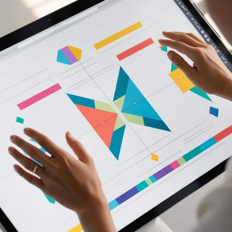
1. Balance: Creating Visual Harmony
Balance is a principle that refers to the distribution of elements within a design. The goal is to create a design that feels stable and visually harmonious. There are three types of balance in graphic design:
- Symmetrical Balance: This is when elements on one side of the design mirror those on the other side. Symmetrical designs tend to feel formal and orderly. For example, a logo with the same elements on both sides of a central axis uses symmetrical balance.
- Asymmetrical Balance: In asymmetrical balance, elements are not identical but are arranged in a way that feels visually balanced due to their size, color, and placement. This balance is more dynamic and often used in modern designs.
- Radial Balance: This involves elements radiating out from a central point. It can be seen in circular designs, where the elements are arranged around a center.
Practical Tip: For beginners, start with symmetrical balance when learning to balance your designs. As you grow more comfortable, experiment with asymmetrical and radial balance to create more dynamic compositions.
2. Alignment: Creating Order and Structure
Alignment refers to the way elements are positioned relative to each other on the page. Proper alignment creates a sense of order and makes your design easier to follow. Misalignment, on the other hand, can make a design feel disorganized and chaotic.
There are several types of alignment:
- Left Alignment: Text and elements are aligned to the left edge, which is the most common and easiest to read.
- Right Alignment: Text and elements are aligned to the right edge.
- Center Alignment: Elements are aligned to the center, often used for headings or emphasis.
Practical Tip: Use grids or guides in your design software to ensure elements align neatly. This simple practice will help you create cleaner, more professional designs.
3. White Space: The Power of Empty Space
White space, also known as negative space, is the empty space around and between design elements. While it might seem counterintuitive to leave areas empty, white space is a powerful tool in design. It allows the viewer’s eye to rest, improves readability, and helps create focus on the most important elements.
By giving each element some breathing room, you can avoid overcrowding and create a sense of balance in your design. For instance, a business card with a lot of white space around the text will feel more refined and professional.
Practical Tip: Don’t be afraid of white space! Try reducing clutter in your designs by using generous margins and spacing between elements. It will not only improve the aesthetics but also make your design feel more modern and sophisticated.
4. Contrast: Enhancing Visual Appeal and Readability
Contrast involves the use of different elements, such as color, size, shape, or texture, to create distinction between parts of the design. Contrast helps important elements stand out, improves readability, and adds visual interest.
For example, using dark text on a light background or bold typography for headings creates contrast that draws the eye.
Practical Tip: When using contrast, be mindful of readability. Ensure that there is enough contrast between text and background colors so that your content is easy to read. If you’re designing for web or mobile, be sure to check accessibility standards to ensure your designs are readable for everyone.
5. Repetition: Reinforcing Visual Consistency
Repetition refers to the reuse of certain elements throughout a design to create consistency and unity. This could involve repeating colors, fonts, shapes, or patterns to tie various parts of your design together.
For example, you might use the same font style for all your headings or a particular color scheme throughout your brochure. This helps create a cohesive visual identity.
Practical Tip: Pick a few key design elements, like a specific color palette or a set of icons, and use them consistently across your design to reinforce a unified look.
Putting It All Together: Practical Tips for Beginners
- Start Simple: As a beginner, don’t overcomplicate your designs. Focus on mastering the basic principles of balance, alignment, and white space before moving on to more advanced concepts.
- Use Grids and Guides: Grids are invaluable for maintaining alignment and balance in your design. They provide a structure to your layout, making it easier to place elements in a visually pleasing way.
- Focus on Typography: Fonts play a huge role in the overall aesthetic of a design. Make sure your typography is legible and fits the tone of your design. Avoid using too many different fonts—stick to two or three at most.
- Experiment and Iterate: Graphic design is all about experimentation. Try different layouts, colors, and alignments until you find a combination that feels right. Don’t be afraid to make changes as you go along.
Conclusion
Graphic design is both an art and a science. By understanding the key principles of layout, balance, alignment, white space, and contrast, you can start creating designs that are visually appealing and effective in communicating your message. Whether you’re designing a logo, website, or print material, these principles will help guide you toward creating professional, polished designs.
As you continue learning and practicing, you’ll develop your own style and design sensibility. Keep experimenting, stay inspired, and remember that every great designer starts with the basics.